“They experience time and motion differently.”
There’s been plenty of good blog-writing on Grant Morrison and Frank Quitely’s We3: Ian Brill, Ian Brill again, Jog. Johnny Bacardi, Johanna Draper Carlson, Marc Singer. And most of you have probably already read it anyway, so I’ll skip the overview and get right into a close look at the book’s many visual pleasures. All of the images in this post are links to larger images.
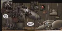
The image to the left (We3 #3, p. 23) is one of the best examples of the most common layout technique used in We3: a large image with small panels overlaying it. The technique is used in other comics, but Morrison and Quitely use it better than most, as the overlay panels don’t act as part of the story’s sequential-art narrative, but instead act as meaning-modifiers on the large image. In the large image, Bandit and Weapon 4 are angrily staring each other down, but the two eye closeups complicate their staredown in two ways: their positioning emphasizes Weapon 4’s physical and emotional dominance of Bandit, and Bandit’s eye reveals his terror. Marc Singer points out the panel of “a minuscule dog that seems to represent how 1 views himself after a whiff of 4’s combat pheromones” (I thought it was a rat until Marc mentioned it!) whose presence seems to imply that the overlay panels aren’t necessarily part of the diegesis, not only because there is obviously no diegetic tiny dog, but also because the way it blends in with the larger image suggests that there is, impossibly, a tiny dog standing directly in front of Bandit. The moment of cognitive dissonance between the impossibility that there is a tiny dog and the visual implication that there is a tiny dog confronts the reader with the diegetic ambiguity of the overlay panels. That ambiguity makes the set of eye closeups even more interesting, because there’s no telling whether Bandit’s expression of terror is diegetic or non-diegetic—there’s no telling whether Bandit looks terrified or only feels so. And, as desperate as Bandit must be to hide his terror, he must not be sure he’s really hiding it—and haven’t most of us found ourselves desperately hoping our true emotions are invisible at one time or another? I know I have.
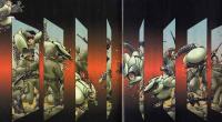
Some overlay panels seem to represent snapshot glimpses of what the combatants see in the midst of battle—the image to the left (We3 #2, pp. 6-7) is one of the most spectacular uses of snapshot overlay panels. I’ve never been in a fight, let alone a military battle, but I always imagine that the experience would be sort of the real-perception equivalent of that image of Bandit leaping through a jeep: a flood of visual information that doesn’t quite add up to a big picture. When the soldiers in the jeep realize a cyborg dog is about to jump through the windshield and maul them, I imagine they get quite an adrenaline rush and sensory overload, but there’s not enough time to make sense of anything. The overlay panels represent visually how the soldiers experience Bandit’s attack. The large image, on the other hand, represents Bandit’s ability, with his cyborg-enhanced animal sense and deadly combat training, to grasp the big picture.
But there’s even more going on in that image: notice the different apparent rates of time in the overlay panels and the big image. The big image uses the standard comic-book technique of duplicate images of one character tracing a path of movement through one panel to create a speed-up effect. The overlay uses a large number of panels showing incremental stages of a single action to create a slow-motion effect—look at the top tier, in which a bullet takes eight panels to travel through a soldier’s head, and the lowest tier, in which a soldier’s foot takes three panels to lift off the gas pedal. These actions take a fraction of a second, but the multiplication of panels dilates the diegetic time. Other overlay panels don’t appear to fit together narratively at all, and the breakdown of narrative cohesion fragments the diegetic time. When I try to read the overlay panels and the big image at the same time—an activity the layout actively encourages—I get three different temporal representations of the same narrative sequence, and the way the conflict between them disjoints my reading only enhances the other perceptual representations I’ve mentioned.
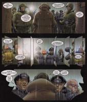
Now, here are two more pages from We3 (We3 #2, pp. 12-13 and #3, p. 6):
The first is another instance of Morrison and Quitely using a standard comics technique—this time it’s a character breaking out of the panel borders, typically used to suggest strength or power—to remarkable effect. In Animal Man, Morrison went meta and allowed characters to see the panel borders and move outside them. In We3, Tinker can move in and out of panels because she moves too quickly for the soldiers to react, and the soldiers are trapped within the panels by their limited perceptual abilities. The panel border comes to represent the limits of perception.
The second panel from the second page above is an allusion to Tinker’s panel-jumping attack—but, on this page, the animals aren’t around. In fact, the sequence of panels—the first with a point of view directly behind the homeless man, the second with the point of view seemingly directly in front of the homeless man, and the third a return to the first panel’s point of view—suggests that the second panel and the smaller overlaid panels represent the homeless man’s point of view. This is the one place in We3 where the panel layout is used to represent a human’s perception. This scene isn’t quite as action-packed as the cat’s attack in issue #2, but the large crowd of police officers and soldiers, flashing squad-car lights and blinding flashlights, would probably disorient most people. The small panels mirroring the panels from issue #2, particularly the penultimate right one that shows a closeup of the hand that grasps the homeless man from behind in the third panel—a hand the man shouldn’t be able to see—indicates the homeless man has superhuman perceptual abilities similar to the animals’. (Jog has the same idea, but he doesn’t seem convinced of it.) I think this strengthens Rose’s theory that the homeless man is a veteran—maybe the military did something to him that made him like We3, something that obviously doesn’t happen to everybody in the military. His ready acceptance of talking animals and confident determination to remove their “coats” seems to suggest he’s mentally unbalanced (he says he needs liquor, and the building where he lives is full of broken bottles—is he an alcoholic?), but maybe he knows more than he lets on.
No wonder Morrison called his recent Vertigo work “supercompressed.” Where a “decompressed” comic book enforces extended examination of a limited set of information through slow pacing and repetitive panels depicting incrementally changing scenes, We3 has an almost overwhelming amount of information packed into it, with even the spatial relationships between panels on the page modifying and extending the meaning of the pictures. I could go on and on, but this is enough for now.
