There’s been plenty of good blog-writing on Grant Morrison and Frank Quitely’s We3: Ian Brill, Ian Brill again, Jog. Johnny Bacardi, Johanna Draper Carlson, Marc Singer. And most of you have probably already read it anyway, so I’ll skip the overview and get right into a close look at the book’s many visual pleasures. All of the images in this post are links to larger images.
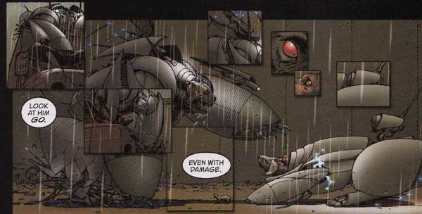
The image to the left (We3 #3, p. 23) is one of the best examples of the most common layout technique used in We3: a large image with small panels overlaying it. The technique is used in other comics, but Morrison and Quitely use it better than most, as the overlay panels don’t act as part of the story’s sequential-art narrative, but instead act as meaning-modifiers on the large image. In the large image, Bandit and Weapon 4 are angrily staring each other down, but the two eye closeups complicate their staredown in two ways: their positioning emphasizes Weapon 4’s physical and emotional dominance of Bandit, and Bandit’s eye reveals his terror. Marc Singer points out the panel of “a minuscule dog that seems to represent how 1 views himself after a whiff of 4’s combat pheromones” (I thought it was a rat until Marc mentioned it!) whose presence seems to imply that the overlay panels aren’t necessarily part of the diegesis, not only because there is obviously no diegetic tiny dog, but also because the way it blends in with the larger image suggests that there is, impossibly, a tiny dog standing directly in front of Bandit. The moment of cognitive dissonance between the impossibility that there is a tiny dog and the visual implication that there is a tiny dog confronts the reader with the diegetic ambiguity of the overlay panels. That ambiguity makes the set of eye closeups even more interesting, because there’s no telling whether Bandit’s expression of terror is diegetic or non-diegetic—there’s no telling whether Bandit looks terrified or only feels so. And, as desperate as Bandit must be to hide his terror, he must not be sure he’s really hiding it—and haven’t most of us found ourselves desperately hoping our true emotions are invisible at one time or another? I know I have.
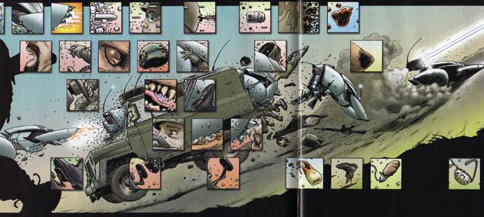
Some overlay panels seem to represent snapshot glimpses of what the combatants see in the midst of battle—the image to the left (We3 #2, pp. 6-7) is one of the most spectacular uses of snapshot overlay panels. I’ve never been in a fight, let alone a military battle, but I always imagine that the experience would be sort of the real-perception equivalent of that image of Bandit leaping through a jeep: a flood of visual information that doesn’t quite add up to a big picture. When the soldiers in the jeep realize a cyborg dog is about to jump through the windshield and maul them, I imagine they get quite an adrenaline rush and sensory overload, but there’s not enough time to make sense of anything. The overlay panels represent visually how the soldiers experience Bandit’s attack. The large image, on the other hand, represents Bandit’s ability, with his cyborg-enhanced animal sense and deadly combat training, to grasp the big picture.
But there’s even more going on in that image: notice the different apparent rates of time in the overlay panels and the big image. The big image uses the standard comic-book technique of duplicate images of one character tracing a path of movement through one panel to create a speed-up effect. The overlay uses a large number of panels showing incremental stages of a single action to create a slow-motion effect—look at the top tier, in which a bullet takes eight panels to travel through a soldier’s head, and the lowest tier, in which a soldier’s foot takes three panels to lift off the gas pedal. These actions take a fraction of a second, but the multiplication of panels dilates the diegetic time. Other overlay panels don’t appear to fit together narratively at all, and the breakdown of narrative cohesion fragments the diegetic time. When I try to read the overlay panels and the big image at the same time—an activity the layout actively encourages—I get three different temporal representations of the same narrative sequence, and the way the conflict between them disjoints my reading only enhances the other perceptual representations I’ve mentioned.
Now, here are two more pages from We3 (We3 #2, pp. 12-13 and #3, p. 6):

The first is another instance of Morrison and Quitely using a standard comics technique—this time it’s a character breaking out of the panel borders, typically used to suggest strength or power—to remarkable effect. In Animal Man, Morrison went meta and allowed characters to see the panel borders and move outside them. In We3, Tinker can move in and out of panels because she moves too quickly for the soldiers to react, and the soldiers are trapped within the panels by their limited perceptual abilities. The panel border comes to represent the limits of perception.
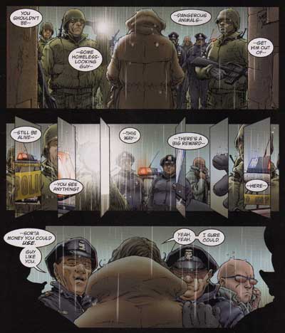
The second panel from the second page above is an allusion to Tinker’s panel-jumping attack—but, on this page, the animals aren’t around. In fact, the sequence of panels—the first with a point of view directly behind the homeless man, the second with the point of view seemingly directly in front of the homeless man, and the third a return to the first panel’s point of view—suggests that the second panel and the smaller overlaid panels represent the homeless man’s point of view. This is the one place in We3 where the panel layout is used to represent a human’s perception. This scene isn’t quite as action-packed as the cat’s attack in issue #2, but the large crowd of police officers and soldiers, flashing squad-car lights and blinding flashlights, would probably disorient most people. The small panels mirroring the panels from issue #2, particularly the penultimate right one that shows a closeup of the hand that grasps the homeless man from behind in the third panel—a hand the man shouldn’t be able to see—indicates the homeless man has superhuman perceptual abilities similar to the animals’. (Jog has the same idea, but he doesn’t seem convinced of it.) I think this strengthens Rose’s theory that the homeless man is a veteran—maybe the military did something to him that made him like We3, something that obviously doesn’t happen to everybody in the military. His ready acceptance of talking animals and confident determination to remove their “coats” seems to suggest he’s mentally unbalanced (he says he needs liquor, and the building where he lives is full of broken bottles—is he an alcoholic?), but maybe he knows more than he lets on.
No wonder Morrison called his recent Vertigo work “supercompressed.” Where a “decompressed” comic book enforces extended examination of a limited set of information through slow pacing and repetitive panels depicting incrementally changing scenes, We3 has an almost overwhelming amount of information packed into it, with even the spatial relationships between panels on the page modifying and extending the meaning of the pictures. I could go on and on, but this is enough for now.
Jog says:
Actually Steven, I’m decidedly more open to the idea of the homeless fellow as in possession of enhanced abilities than I was at the time of writing my review (ooooh, perhaps that’s why Dr. T was so eager to shift the burden of combat onto ‘lower’ animals, to spare soldiers not only death, but experimentation!)… thanks in large part to comments left on my own page, as well as discussion all over the place.
Very nice discussion of the visuals here; the book is quite deep, and there’s so much to mull over, and I think a lot of meaning can be found in Quitely’s art…
— 11 February 2005 at 1:01 am (Permalink)
Dave Lartigue says:
I think that speculating about whether or not the homeless man (no doubt a vet) has been enhanced misses an important point. Rounding up stray animals, taking them from their loving homes, turning them into killing machines and sending them to do things they barely understand the meaning of: is that not what we’re doing to young people in Iraq? Changing domesticated beings into cybernetic engines of destruction? The veteran doesn’t have to have been fantastically altered by the government to sympathize with WE3; his mere experience of combat would be enough to enter their world.
— 11 February 2005 at 1:36 pm (Permalink)
Steven says:
Jog: Awesome!
Dave,
You’re definitely right, I think, that that’s the important connection between the homeless guy and the animals, and I didn’t miss it in reading, although I neglected to bring it up in my post. Still, there’s something that gives the homeless vet an advantage over all the other soldiers in the story—partly that the animals recognize him as kindred, but those overlay panels in issue #3 indicate something more going on, to me. But, whatever it is, it does lead to the connection you point out, so thanks for pointing it out.
— 11 February 2005 at 1:50 pm (Permalink)
Rose says:
— 11 February 2005 at 2:33 pm (Permalink)
Dave Intermittent says:
Steven,
Nice piece; the visual ambition of the book would make this a worthwhile read even if it were lacking in heart, which of course it is not. It’s interesting that lots of the techniques used have been floating around some time at the margins of mainstream comics (I remember an issue of Grendel or two where Matt Wagner played around with the tiny tiny panels idea, and obviously Miller used similiar overlays in DK) without generating near the same amazement. Maybe the visual sense of most modern comics has gotten constrained enough that We3 has more impact than its older cousins, competing as they were with fairly radical spinner rack work by Sienkevicz, Simonson, Kane, etc. Sort of sad that this kind of ambition isn’t the norm.
One nit to pick. I think that decompressed/supercompressed labels are well past their use date, insofar as whatever signifigance they once had has been lost in the communal rush to use them simply to mean, respectively, “talky”/”bad” or “action-packed”/”good”. Even your definition is flawed. Geof Darrow’s work, for example, could be described as decompressed, insofar as his pages don’t tend to be crowded with panels, and the main action within each panel is very easily and quickly absorbed. But of course beyond the main action his panels are crowded with layer upon layer of peripheral action, some of it commenting on the main action, some of it gratioutious, some of it lending mood (See Jog’s review of Shaolin Samurai for more, particularily his take on the, what, six page spread of bad guys staring down the hero) So is it decompressed or not?
— 11 February 2005 at 3:28 pm (Permalink)
Steven says:
— 11 February 2005 at 4:20 pm (Permalink)
Jamesmith3 says:
— 11 February 2005 at 9:32 pm (Permalink)
Steven says:
What’s going on with the tilty panels in issue #3, then? Obviously, I agree that the stuff I wrote about has to do with our own perception/reading of the story—but most of it simultaneously works to represent how characters are able to see what’s going on. Whether or not Bandit literally sees the soldier’s foot lifting off the pedal, the layouts on that and other pages seem to me very much reflective of the animals’ ability to see more. Maybe the vet didn’t go through a military cyborg program himself (the textual evidence is sparse at best), but I think the way the panel from his point of view mirrors Tinker’s panel jumping suggests that, for whatever reason, he’s more than some crazy homeless vet.
I have to go now, though, so I’ll have to cut this comment short.
— 11 February 2005 at 9:52 pm (Permalink)
Jamesmith3 says:
Aside from being clever? I think that’s to do as you suggested– showing the confusion of the lights and rain and voices.
The 2nd tier on that page is a single, unbroken shot with 4 un-anchored word balloons, each with only sentence fragments in them. That probably doesn’t strke you as strange, because we’ve been seeing it at least since the late 80’s. But, if you think about that technique, it’s just as fragmentary and disjointed as breaking up the visual plane in the 3rd tier. If the 2nd tier doesn’t suggest some sort of superhuman nature on the vet’s part, I don’t see why the 3rd tier should either.
Here’s what it does: In the 4th tier, the cop says, “–sorta money you could use. Guy like you.” Going onto the next page, the vet responds, “Yeah. Yeah. I sure could. But… nah… I seen nothin’, you fascist pig assholes.” Why do we understand that? We’re not getting complete thoughts from these people, but we understand their meanings, we understand their mutual comprehension, based on the disjointed parts we’re being given. That 3rd tier is Morrison and Quitely doing the same thing with pictures. Each “slice” is a phrase that composes the visual whole, just like the word balloons that contain only phrases.
— 11 February 2005 at 10:47 pm (Permalink)
Dave Intermittent says:
I’m not inclined to read the panels as indicating that the homeless vet is in any way cybernetically endowed, if for no other reason than lots of the panel choices througout the series are made not to convey information about a character but to convey maximum reaction: the security camera spreads in issue one (especially in that they lead in to the big double page freedom spread), the double page bullet spread in the same issue being the ones that jump immediatley to mind. I suspect that from a formal standpoint, one of Morrison’s goals was to create an action comic with real visceral impact, and that many of the layout decisions werre based less on serving some symbolic goal and more on what would most make folks go “whoah!” The freedom spread made me go whoah after four pages of looking at tiny claustrophobic panels.
And with respect to the decompression bit….my assumption, my bad. Though I do still get irked by people using the term as an all purpose pejoritive….
Some other last thoughts that I’m dumping here, since I likely will never muster up the energy to write up a real post of my own. In most of the mini, the general and T’s faces are obscured. I had suspicion, very briefly, that they only get to have full faces when they make decisions, but that doesn’t seem to hold water. And on a wildly different note, it felt odd to me that we so no issue three fallout from Bandit’s murder of the hunter; it sort of undercuts Bandit’s role in as the moral heart of the story.
Lastly, in reponse to Rose, and, by extension, the rest of Ian’s comment thread, I’m sort of surprised that this is read as an anti-U.S. piece rather than an anti-militarism piece. I don’t recall anything that takes a specific swipe at America; even the military officer is given nuance rather than being presented as some sinister Dr. Strangelove type, which is, frankly, a big step forward from Morrison’s usual portrayal of military men as being underground demons looking for souls to deaden. The fact that people read a critique of militarism as a critique of America is a rather more telling critique of America, I think, than anything in We3.
— 12 February 2005 at 1:46 am (Permalink)
Steven says:
Hmm, hmm. OK, James, I think your interpretation of the tilty panels in issue #3 is probably better than mine!
Dave, I thought the cut-off faces seemed to correspond to when there were animals in a scene. Like, in the first issue, the humans’ faces are cut off by the panel borders when they’re with We3 or the rats—except for Roseanne Berry, who always gets full-face panels when talking to the animals. It seemed to be an indication of the closeness of humans’ relationship with the animals.
Bandit attacks the hunter in self-defense only after the hunter shot Pirate—the hunter isn’t a “gud man” to be helped but an enemy combatant.
— 12 February 2005 at 2:10 am (Permalink)
Dave Intermittent says:
You’re likely right on the face issue.
The interesting thing about the hunter is that he isn’t an enemy combatant, and that Bandit realizes that he did wrong. The hunter only shoots to protect his son, and only after Pirate starts forward; he shoots first, but then again he does have a cybernetic death bunny rocketing towards him. Bandit acknowledges the qualitative difference between the hunter and the soldiers; he realizes that, in killing someone who is not a soldier–in killing a civilian he is supposed to protect, since a good dog helps man–he’s become a bad dog. He spares no such remorse for any of the soldiers….like I said,it seems odd to me that this moment, which felt to me absolutley pivotal when I first read #2, is largely forgotten in #3.
But then again, maybe that’s just me.
— 12 February 2005 at 5:20 am (Permalink)
Steven says:
I figured Bandit considered himself a “bad dog” because he failed to protect pirate, not because he killed the man. Looking at the scene in question, I’m not so sure the animals are capable of fine distinctions between hostile soldiers and panicky civilians firing in self-defense. That’s how I read the scene, anyway—that animals (except for Pirate, who never does seem to have much fighting spirit) recognize a human firing a gun at them as an enemy and not a “gud man.”
— 15 February 2005 at 4:37 pm (Permalink)
I Blog the Comics § Unqualified Offerings says:
[…] in New X-Men and JLA. His recent killer robot animal miniseries with artist Frank Quitely, We3, was a masterpiece. The Filth was a challenging and rich, if flawed, work. But wha […]
— 27 April 2005 at 3:22 am (Permalink)